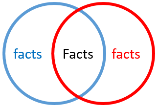
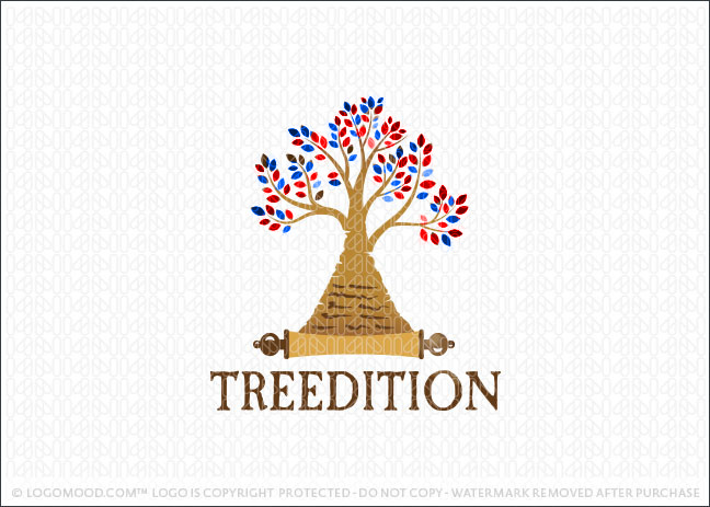
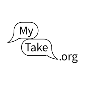
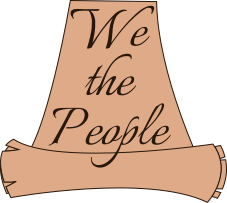
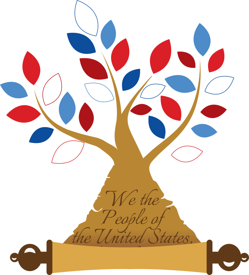
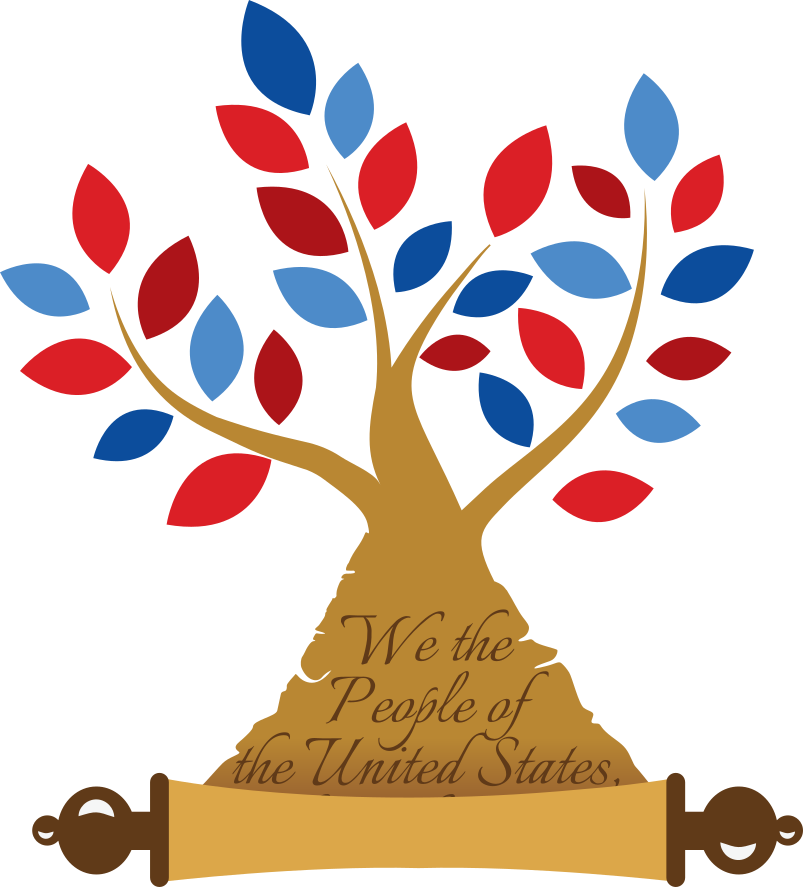
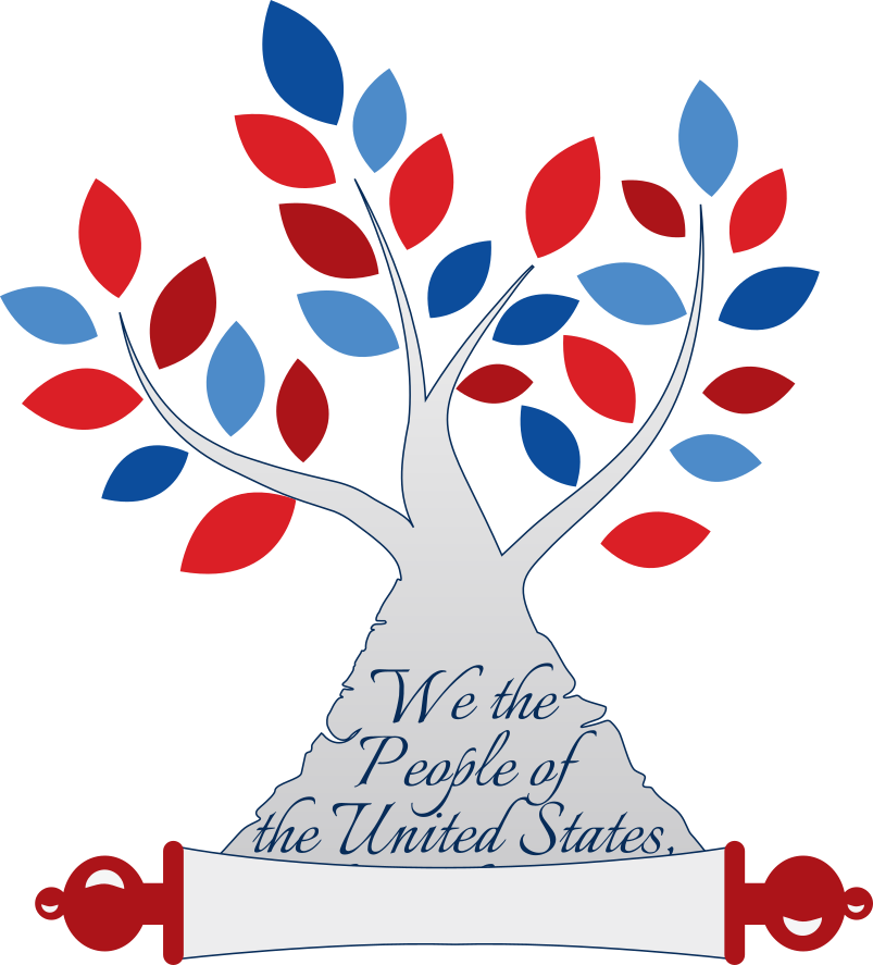
Ooh, I like the concept of the venn-diagram applied to speech bubbles. I also like the frayed edges on the scroll. Inkscape skillz.
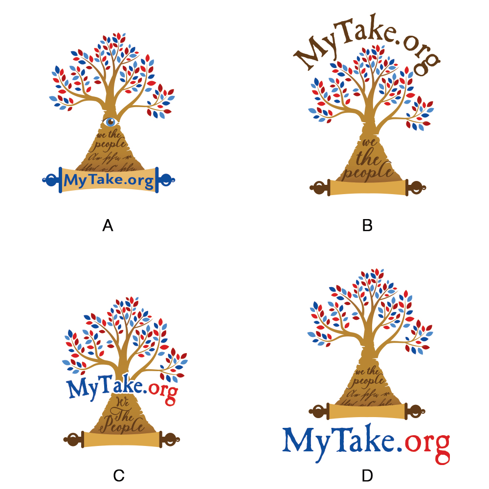
I’m a little concerned about the “.org” being an afterthought rather than a key part of the logo. I think it’s fine if the words are not in the logo at all (e.g. venn-diagram speech bubbles on their own), but I’m a little nervous about TM issues if users could reasonably assume that our name is “My Take”, rather than “MyTake.org”.
I think we can subdivide our users into three groups
-
Reader Only interaction with MyTake.org is via reading (either a take or just a foundation permalink)
-
Author, no account Posts foundation permalinks to facebook / twitter
-
Author, has account Publishes and shares takes
All our users are going to start as Reader, some will become Author, no account, only a few will become Author, has account.
It seems we have a few brand themes that make sense, which we can mush them together. Here’s the order that we “discovered” these themes in this thread
- common-ground (venn-diagram)
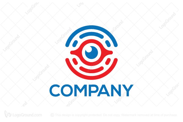
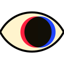
- see for yourself (eye)
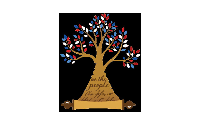
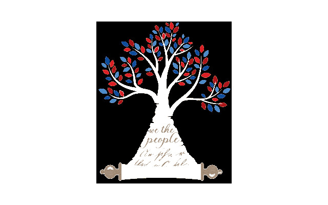
- patriotism (red white & blue / stars & stripes)
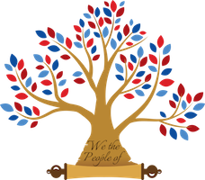
- stable truth (foundation / trunk / scroll)
- discussion (speech bubble)
We aren’t really building a discussion product. We discussed this option in the past (4, 5), but decided against it because we don’t have anything novel to offer. It would be nice if people wanted to compromise and discuss nicely, but they don’t - building a site for nice discussion isn’t going to have many users. We’re building a self-advertising research tool, which self-advertises via published takes and foundation permalinks on social media.
In terms of the themes above, I think all 5 are important to us, but I’d personally rank them them in this order:
- stable truth (foundation / trunk / scroll)
- see for yourself (eye)
- common-ground (venn-diagram)
- patriotism (red white & blue / stars & stripes)
- discussion (speech bubble)
Here’s how I think we should decide to commit to a brand.
- We’re all confident that we don’t have any more ideas for themes.
- We’re all confident in the ranking of the themes.
- We’re all happy that the logo we’ve selected manifests the most-important themes, and is easy to identify in the 48x48 circle that social media allows us.
Personally, I’m quite satisfied with the “TreeEdition” logo. I think it hits our most important theme, and offers lots of opportunities for variants that emphasize the other themes which are important to us.
But there’s no rush, so until we’re all happy with it, we should keep looking.