Does it really look like wheat? I just used the top-most branch from the tree logos. Bummer. Wheat doesn’t make any sense at all. I’ll keep trying.
Oh, and the pixesl are “off” because I used a vector program to draw a bitmap image. In the end result, I’d tighten that up by using a different drawing program.
We actually don’t have control over which size icons Facebook and Twitter use. We upload big ones and they compress them depending on the use case. Also, when other people share content from our page, our logo is not displayed. It’s only displayed when the MyTake.org Facebook/Twitter accounts share something.
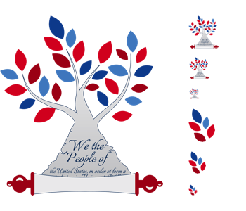
Here’s a layout similar to what you posted. The sizes are 256x256, 48x48, 32x32, and 16x16.
Does it really look like wheat?
Yes.  But I don’t think that’s a problem. Wheat is good american stuff, and I think it looks great. Next to the tree I think it’s obvious that they’re connected.
The grey is a noble attempt to go red/white/blue, but I think it makes it harder to tell that it’s a tree. Part of why the 16x16 icons I pasted work is that they’re tree-colored. We have a hard time because of red & blue leaves, but having no tree colors at all makes it a real stretch. I can’t help but think of this, and I haven’t even seen GOT.
I used a vector program to draw a bitmap image
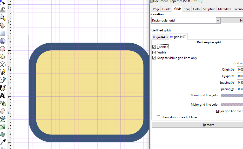
You can make vectors that have sharp lines at 16x16, if you put a grid at 1px spacing, and another grid at 0.5px spacing. You don’t have to line things up exactly, but when there’s 3 or 4 pixels in a row where a line is less than half-way in the row / column, it sharpens up a lot if you nudge it to be either in or out. Especially important if we only get to upload one image, and the service does the downscaling for us.
The sizes are 256x256, 48x48, 32x32, and 16x16.
Perfect! This helps a lot 
I don’t think the simplified tree is working at any of those sizes. At 256x256 the original looks better, 48x48 it’s barely okay, but for the rest it’s still too detailed. I’d be curious to see a no-individual leaf tree, with blotches to hint at different colors. But the wheat is really growing on me!
You should have access to our facebook page and our twitter page. Wanna try using the original in the banner, and wheat in the profile? See how it looks?
When I look at the grayish tree I see Roger from American Dad.
The problem with redesigning the tree to have blotches for the different colors is that it requires redesigning the tree in the first place, which is a very slow and painful process for me. Also, if we have a tree with leaves at 256x256 we can’t always control which scaled down version is shown.
My upscaled version of a blothcy 16x16 tree  looks childish. Also you have a very good point about the fact that we aren’t using tree colors. It makes these things unrecognizable at low resolutions.

Also, did you know you can use videos in Facebook page banners now? I’ll log in and mess with the best of what we have so far.