
We need a new site header design that makes our site easy to understand to a new user, looks great, and meets Google’s design standards.
Important questions to answer
What is the primary action that we want the user to take? What is the primary action that a user wants to take? The answers to these questions are critical to our header design and our homepage design.
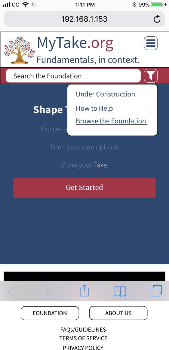
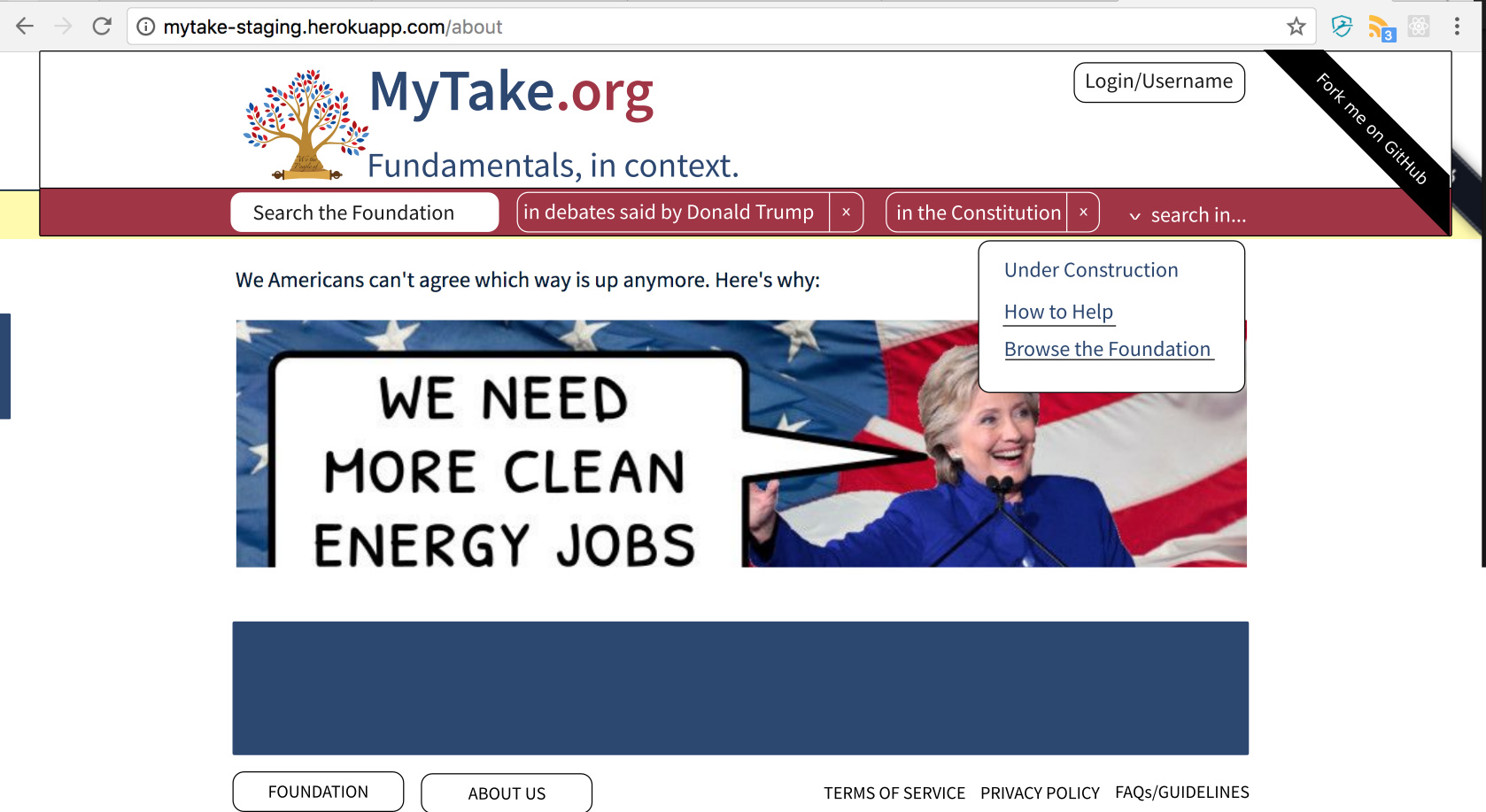
What needs to be in our header
- Logo/MyTake.org/Tagline
- The navigation menu
- A search box

What needs to be in our navigation menu
- The foundation
- Profile/Account
- About us
- Log out (only when a user is logged in)
I think we should remove the logged in user’s navigation actions from the header. At least on mobile. These are links that may not be important anymore and they can always be accessed by going to the Profile/Account page.
We can put any extra links in the footer, like links to important/popular meta.mytake.org topics.
What needs to be on our homepage
If we are steering away from drafting takes, maybe instead of a feed of published takes this should be an about page sprinkled with links to the foundation. We can give a high-level “about us” on the homepage and a more detailed “about us” on the about us page.